# A tibble: 22 × 21
    rank major_code major          major_category  total sample_size   men women
   <int>      <int> <chr>          <chr>           <int>       <int> <int> <int>
 1     5       2405 Chemical Engi… Engineering     32260         289 21239 11021
 2     9       2414 Mechanical En… Engineering     91227        1029 80320 10907
 3    10       2408 Electrical En… Engineering     81527         631 65511 16016
 4    11       2407 Computer Engi… Engineering     41542         399 33258  8284
 5    12       2401 Aerospace Eng… Engineering     15058         147 12953  2105
 6    13       2404 Biomedical En… Engineering     14955          79  8407  6548
 7    16       2402 Biological En… Engineering      8925          55  6062  2863
 8    17       2412 Industrial An… Engineering     18968         183 12453  6515
 9    18       2400 General Engin… Engineering     61152         425 45683 15469
10    21       2102 Computer Scie… Computers & M… 128319        1196 99743 28576
# ℹ 12 more rows
# ℹ 13 more variables: sharewomen <dbl>, employed <int>,
#   employed_fulltime <int>, employed_parttime <int>,
#   employed_fulltime_yearround <int>, unemployed <int>,
#   unemployment_rate <dbl>, p25th <dbl>, median <dbl>, p75th <dbl>,
# college_jobs <int>, non_college_jobs <int>, low_wage_jobs <int>Lab 6: Polishing figures
Question
Question
Use the data wrangling skills you learned in Lab 4 to restrict the data set to:
- only those majors that belong to the
major_categoryvalues ofComputers & MathematicsandEngineering, and - only those majors with at least 5,000
totalgraduates.
To avoid overwriting the original college_recent_grads data, assign the resulting data frame to a new object called college_majors.
Hint: the filter() function is your friend!
Check: When you’re done, your new data frame should have 22 rows.
Question
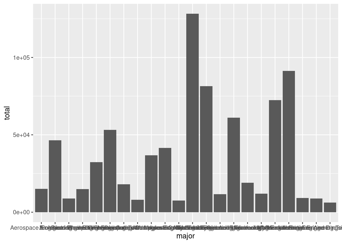
Insert a new code chunk, and copy the code template below into this code chunk. Then, fill in the three blanks to create a bar plot showing the total number of recent graduates in each of these 22 majors. Importantly, you should:
- represent the majors along the x-axis of the plot, and the number of graduates along the y-axis of the plot.
- draw a column to represent the number of graduates in each major using the
geom_col()function.
Don’t worry about colors, labels, or anything else just yet.
The code for Exercise 2 won’t print out any results. To check your work for Exercise 1, make sure that results for Exercise 3 match with the Exercise 3 solutions below. If your results from Exercise 3 don’t match the solutions, re-visit your code in Exercise 2.
Question
Display the bar plot you just created in Exercise 2 by inserting a new code chunk, and calling the print() function on your ggplot object.

Question
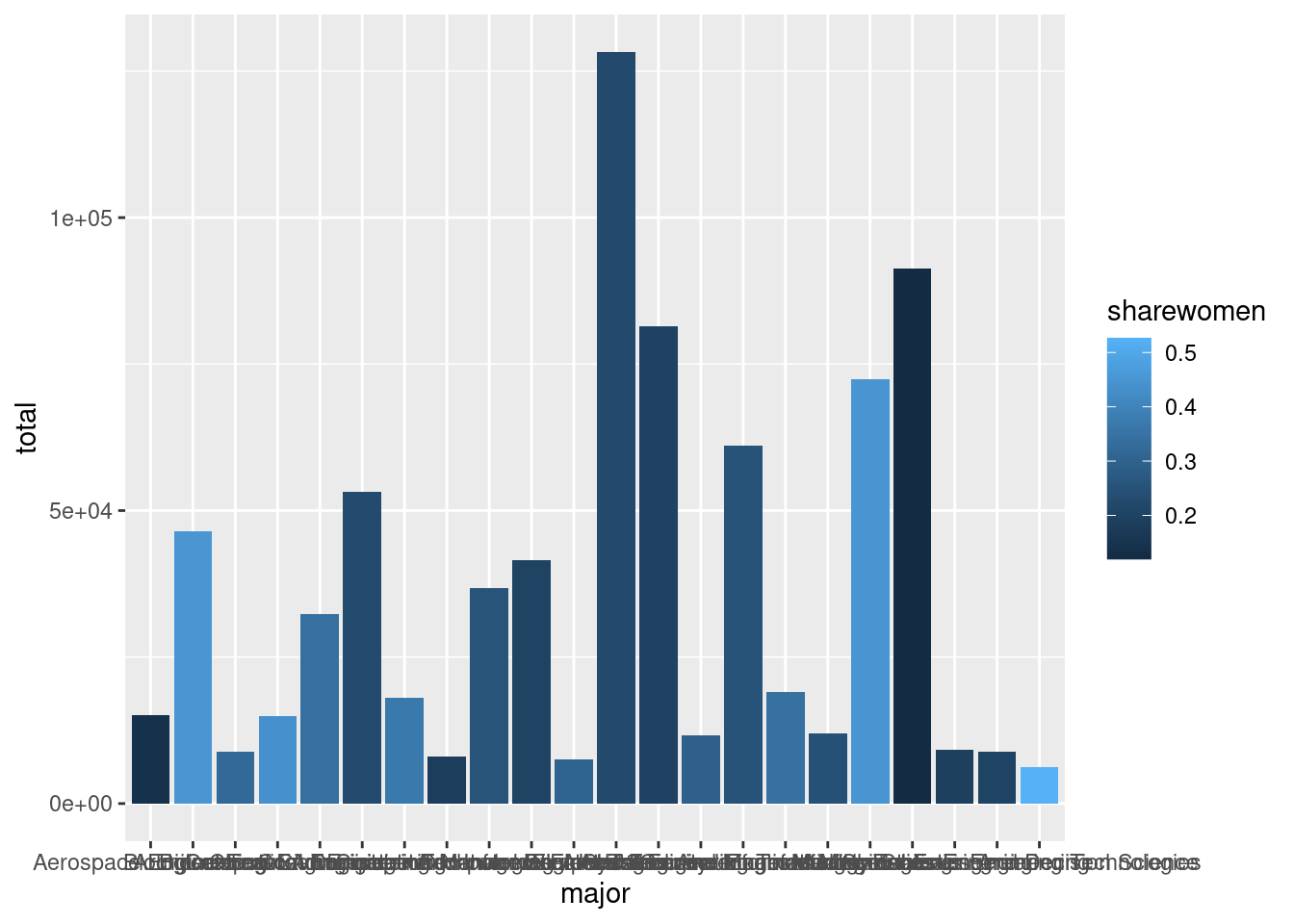
Insert a new code chunk, and copy the code template below into this code chunk. Modify your bar plot by filling in the blank in the code template below. Add a layer-specific aesthetic mapping that will fill in each column in the bar plot with a different color, based on the proportion of graduates in each major that are women.

Question
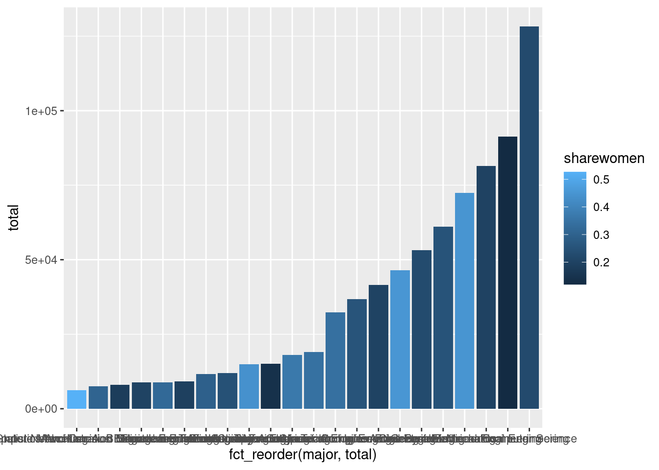
Generalize the example above to modify the x aesthetic so that the bars for each major appear in order according to the total number of recent graduates.
Make sure to use the <- assignment operator to modify your ggplot object permanently!
If you make a mistake, and your plot isn’t coming out right, re-run all the code chunks prior to this exercise to start again with a clean slate.

Question
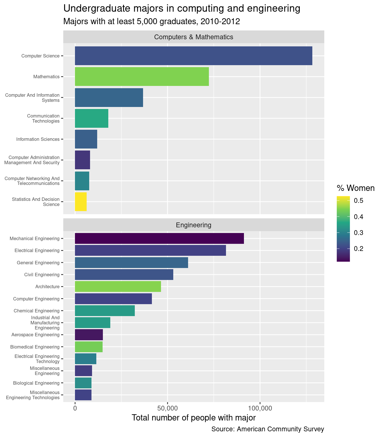
Insert a new code chunk, and copy the code template below into this code chunk. Fill in the blanks in the code template below to add a title, subtitle, and caption to your plot.
Make sure that the text for your plot’s title, subtitle and caption is quoted!
The content of the title, subtitle, and caption do not need to match exactly. But you do need to have all 3 components.
Question
Update your bar plot to use the viridis color palette by adding the scale_fill_viridis_c() function (just like you added the labs() function to the plot).
Use the name argument to for the scale_fill_viridis_c() function to change the name of the color legend to something more informative (e.g., “Percent Women” or “% Women”).
Make sure to use the <- assignment operator to modify your ggplot object permanently!

Question
Remove your plot’s x-axis label by adding the scale_x_discrete() function to your plot. Set the name argument to NULL to supress the axis label.

Question
Force R to use “normal” notation for the numbers along the y-axis of the plot by adding the scale_y_continuous() function to your plot. Use the labels argument within the scale_y_continuous() function to force the numbers to show in the format provided by the scales::label_comma() function.
Also, use the name argument within the scale_y_continuous() function to improve the title for the y-axis, just like you did with the title for the color scale in Question 7.

Question
Update your plot’s x-axis by using the scale_x_discrete() function once again. This time, also pass the scales::label_wrap() function to the labels argument in scale_x_discrete(), and make sure to wrap the major field names to 25 characters.

Question
Use the coord_flip() function to flip the coordinate axes.

Question
Use the facet_wrap() function to create facets for each major_category. Be sure to set the scales and ncol arguments as specified above.
