Lab 6: Polishing figures
Why are we here?
In Lab 3, you learned how to create basic data graphics using ggplot2.
![]()
In this lab, we will extend your understanding of ggplot2 to include many customizations and modifications that will allow you to create production-quality data graphics.
Lab Goals
The purpose of this lab is to learn how to polish data graphics to maximize their readability and impact.
After completing this lab, you should be able to add and modify titles, subtitles, captions, legends, scales, axis labels, and tick labels for ggplot2 data graphics.
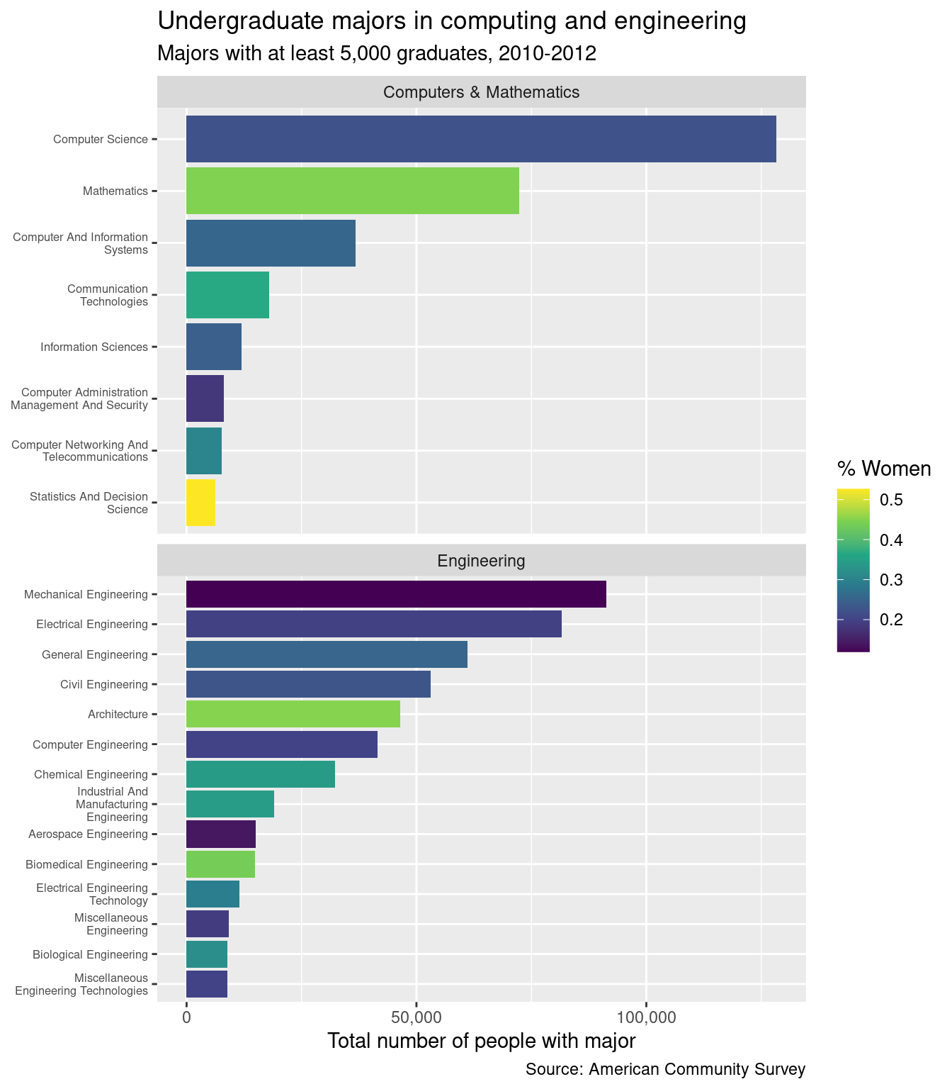
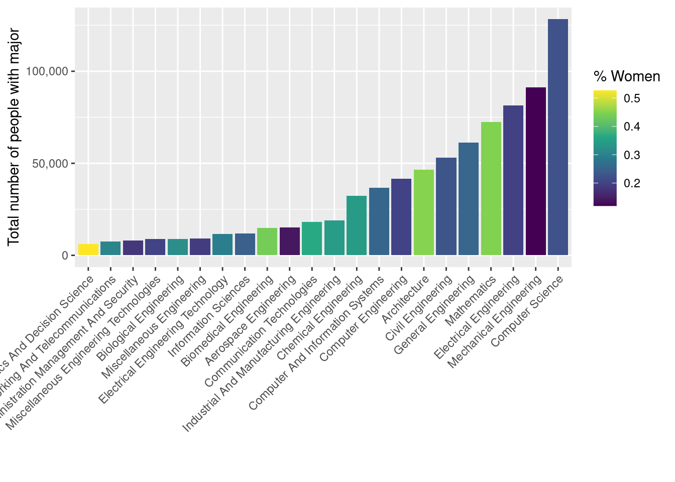
You will know that you are done when you can create this image:
Optional reading
- Chapter 2: Data visualisation from R for Data Science covers much of the same material as in this lab
- Chapter 10: Layers, Chapter 11: Exploratory data analysis, and Chapter 12: Communication provide much more depth in both the how and why of data visualization.
Lab instructions
Setting up
First, download the Lab 6 template.
Before you open the template, use your computer’s file explorer to move the template file you just downloaded out of your Downloads folder and into your SDS 100 folder.
Then, open RStudio, and make sure you’re working in the SDS 100 project. If the
Projectpane in the top right of your RStudio window doesn’t show “SDS 100”, go toOpen Projectas shown below and navigate to your project.
Finally, open the template file in RStudio. The easiest way to do this is to go to the Files pane in RStudio, find the lab_06_polishing.qmd file from the list, and click on it.
If you don’t see a file named lab_06_polishing.qmd in the list, make sure you did steps 2 and 3 correctly. If you’ve double-checked your steps, and still don’t see it, ask your instructor for help.
Next, load the packages you will need to complete this lab:
Question
library(tidyverse)
library(fivethirtyeight)
In this lab, we’ll be working with a data set that is near and dear to your : college majors. These data come from the American Community Survey, which is administered by the US Census Bureau. The data are included in the fivethirtyeight R package. You can read the specifics of which data were included by reading the README.md Markdown file posted on GitHub by FiveThirtyEight, a prominent online data journalism site.
This data set is also the basis for the article “The Economic Guide To Picking A College Major”, which was published on FiveThirtyEight on September 12, 2014. You may find it helpful to read the article to get a sense of what you can do with these data.
Next, spend two minutes familiarizing yourself with the college_recent_grads data frame. You may want to do some combination of the following:
- Read the help file:
help(college_recent_grads) - Inspect the data visually using the RStudio data viewer:
View(college_recent_grads)or click oncollege_recent_gradsin the Environment pane - Inspect the structure of the data frame in the console:
glimpse(college_recent_grads)
What is the unit of observation for these data? In other words, what kind of thing does each row in this data set represent?
Finally, to create the plot shown in Figure 1, you will need to do a bit of data wrangling. You’ll need to restrict the data set to only those majors that belong to the major_category values of Computers & Mathematics and Engineering. And, you’ll need to restrict the data set to only include majors with at least 5,000 total graduates (note that the variable total stores the number of recent graduates in each major).
Question
Use the data wrangling skills you learned in Lab 4 to restrict the data set to:
- only those majors that belong to the
major_categoryvalues ofComputers & MathematicsandEngineering, and - only those majors with at least 5,000
totalgraduates.
To avoid overwriting the original college_recent_grads data, assign the resulting data frame to a new object called college_majors.
Hint: the filter() function is your friend!
Check: When you’re done, your new data frame should have 22 rows.
Making the initial plot
At its most basic level, Figure 1 is a bar graph. Typically, bar graphs use the vertical axis for a numerical quantity, and the horizontal axis for a categorical quantity (Although this is not what is shown in Figure 1!). Let’s start with that.
Question
Insert a new code chunk, and copy the code template below into this code chunk. Then, fill in the three blanks to create a bar plot showing the total number of recent graduates in each of these 22 majors. Importantly, you should:
- represent the majors along the x-axis of the plot, and the number of graduates along the y-axis of the plot.
- draw a column to represent the number of graduates in each major using the
geom_col()function.
Don’t worry about colors, labels, or anything else just yet.
Code
g <- college_majors |>
  ggplot(
    mapping = aes(
      x = _____,
      y = _____
    )
  ) +
  _________
By now, you have probably noticed that despite completing the code template correctly, no figure is showing up in the RStudio plot pane. This is because the figure was saved to an object in your environment instead of being displayed (notice how the code begins with g <-, and a new object named g is shown in the environment pane?).
Whenever a ggplot object is saved to your environment, R stores the plot without displaying it. Luckily, it is easy to display a ggplot object you have saved to your environment. Just call the print() function on your ggplot object, and it will display the figure in RStudio’s plot pane.
Question
Display the bar plot you just created in Exercise 2 by inserting a new code chunk, and calling the print() function on your ggplot object.
Layer-specific aesthetics
So far, our plot allows us to measure two of the variables in our data, major and total. However, our final goal is to recreate Figure 1, which also measures the sharewomen and major_category variables.
It was important to map the x and y aesthetics to major and total in the call to ggplot() because we want all of the layers we add to the plot to inherit those aesthetic mappings.
However, sometimes having a mapping apply to all layers is counter-productive. That’s why ggplot allows you to construct aesthetic mappings that apply only a single later of the plot. You construct these layer-specific aesthetic mappings in the same way you construct the “global” aesthetic mappings: using the aes() function to connect a variable in your data frame with an aesthetic of your figure. The only difference is: you use the aes() function inside the geom_ layer function, instead of inside ggplot().
The next update to our plot will use a layer-specific aesthetic mapping to incorporate the sharewomen variable into our bar plot.
Question
Insert a new code chunk, and copy the code template below into this code chunk. Modify your bar plot by filling in the blank in the code template below. Add a layer-specific aesthetic mapping that will fill in each column in the bar plot with a different color, based on the proportion of graduates in each major that are women.
Code
g <- g +
  geom_col(mapping = _____________)

print(g)
Ordering factors
The ordering of the bars in a bar graph can play a role in helping the reader find what they are looking for quickly. Generally, you probably want the bars ordered either alphabetically (the default, and the easiest to find what you are looking for), or in rank order of bar height (allowing for easy comparisons).
![]()
An easy way to accomplish this is with the fct_reorder() function from the forcats package (part of the tidyverse), which allows you to put one factor in order based on the value of another variable. To do this, it needs two arguments: first, the variable that we want to reorder, and second, the variable that we want to reorder it by.
For example, we could arrange the bars in the plot based on the proportion of major graduates who are women (ordering them from lowest proportion to highest proportion) by using the aes() function to modify the global aesthetic mapping, and using the fct_reorder() function to sort the major variable by the sharewomen variable.
Code
g +
  aes(x = fct_reorder(major, sharewomen))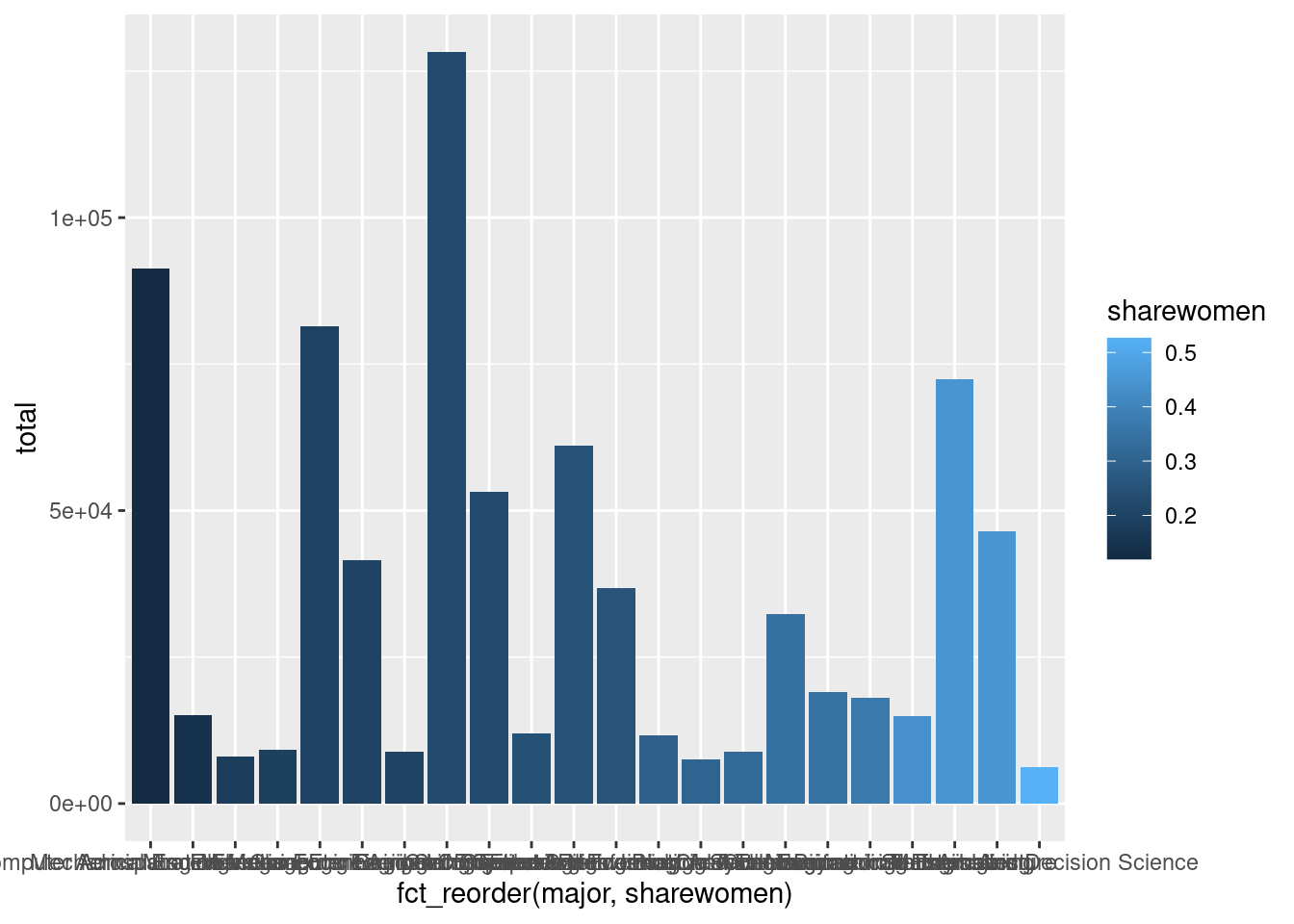
Notice how the bars proceed from the darkest shade on the left (indicating the majors with the lowest proportion of women graduates) to the lightest shade on the right (indicating the majors with the highest proportion of women graduates).
Question
Generalize the example above to modify the x aesthetic so that the bars for each major appear in order according to the total number of recent graduates.
Make sure to use the <- assignment operator to modify your ggplot object permanently!
Tip
If you make a mistake, and your plot isn’t coming out right, re-run all the code chunks prior to this exercise to start again with a clean slate.
Adding a title, subtitle, and caption
A data graphic needs context, and ideally that context appears directly on the graphic. This can be added with the labs() function.
To use this function, we need to add to the graph we made. When making plots with ggplot2, this is usually done by adding new functions at the end of your code rather than modifying code within the ggplot() function. You can add functions that modify your plots legends, axes, and labels by using the + symbol, just like when you add geoms to the plot.
g <- g +
  new_function() # replace this with the function you're adding
Question
Insert a new code chunk, and copy the code template below into this code chunk. Fill in the blanks in the code template below to add a title, subtitle, and caption to your plot.
Make sure that the text for your plot’s title, subtitle and caption is quoted!
Code
g <- g +
  labs(
    title = ______________________,
    subtitle = ___________________________,
    caption =  _________________________
  )
Modifying scales, legends, and axes
In ggplot2, most scales, legends, and axes have default behaviors that are informed by best practices in data visualization. However, a good data graphic is often customized. In this section, we learn how to customize scales, legends, and axes.
Choosing a color palette
The default palette for color gradients in ggplot2 actually makes it difficult to accurately discriminate between values. The viridis palette is an improvement over the default color palette (you can read this explanation to learn why).
Question
Update your bar plot to use the viridis color palette by adding the scale_fill_viridis_c() function (just like you added the labs() function to the plot).
Use the name argument to for the scale_fill_viridis_c() function to change the name of the color legend to something more informative (e.g., “Percent Women” or “% Women”).
Make sure to use the <- assignment operator to modify your ggplot object permanently!
Setting axis labels
Leaving bare variable names as axis labels is bad practice. Your readership does not know or care about your variable names, and they shouldn’t have to interpret your cryptic choices. You should always give each axis a clear, human-readable label, with explicit units.
In this case, the major_category label is not helpful, since the categories are implied by the title. We may be better off by just omitting the label altogether.
Question
Remove your plot’s x-axis label by adding the scale_x_discrete() function to your plot. Set the name argument to NULL to supress the axis label.
Formatting tick labels
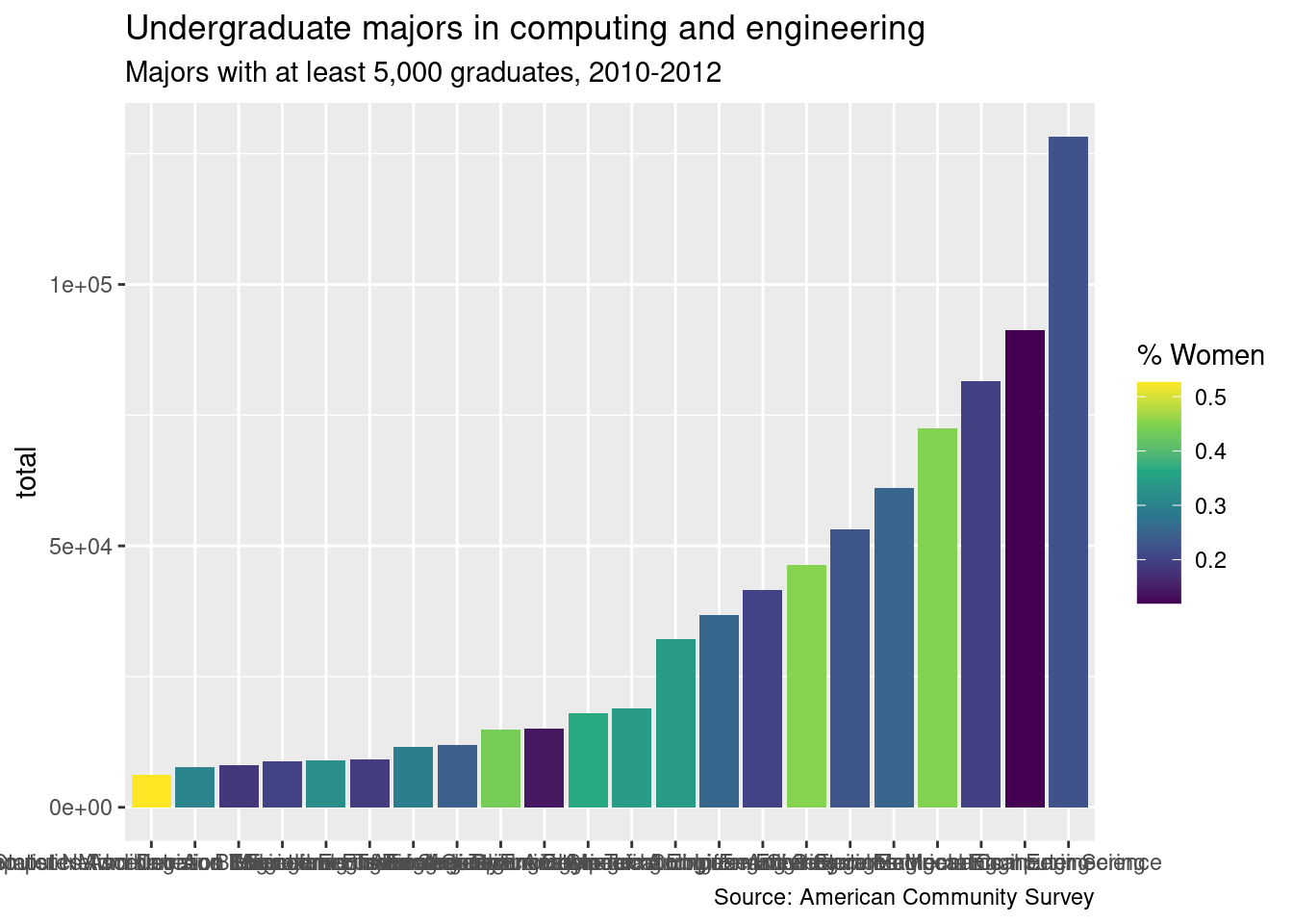
The number of recent graduates is given in scientific notation. This is unnecessarily complicated and difficult to read. The little marks on the axes are called ticks. We can change the format of the tick labels by specifying a function that will be applied to default axis labels. The scales package—which is a dependency of ggplot2—provides several useful functions (all named label_*()) for formatting axis labels.
![]()
The one we want is called label_comma(). Most of the time when we use a function, R will know which package it’s from. However, two different packages may have functions with the same name that do two very different things. In order to be specific about which function to use, we can use the notation package::function(); in this case, we would write scales::label_comma(). This also lets us skip the step of loading the entire scales package (since we only need a single function it provides).
Question
Force R to use “normal” notation for the numbers along the y-axis of the plot by adding the scale_y_continuous() function to your plot. Use the labels argument within the scale_y_continuous() function to force the numbers to show in the format provided by the scales::label_comma() function.
Also, use the name argument within the scale_y_continuous() function to improve the title for the y-axis, just like you did with the title for the color scale in Question 7.
We have fixed the vertical axis, but our plot still isn’t legible, because the labels on the horizontal axis are running into each other.
One option for getting around that is to have the labels printed at a 45 degree angle. We can achieve this by overriding the default angle property of the axis.text.x argument to the theme() function.
Code
g +
  theme(
    axis.text.x = element_text(angle = 45, hjust = 1)
  )
However, in this case, many of the axis labels are really long, so this doesn’t look good. It’s also harder to read text that is at an angle.
Another option is to wrap the text in the labels. The simplest way to do this is to use another function from scales: label_wrap(). This function takes an argument that specifies the number of characters after which to wrap the text.
Question
Update your plot’s x-axis by using the scale_x_discrete() function once again. This time, also pass the scales::label_wrap() function to the labels argument in scale_x_discrete(), and make sure to wrap the major field names to 25 characters.
Flipping the orientation
This helps, but the labels still aren’t readable.
A better effect is achieved by flipping the coordinate axes. We could go back and change the way that we assigned the x and y aesthetics, but then we’d have to re-run all of our code. Instead, we will use the coord_flip() function to re-orient our existing plot.
Question
Use the coord_flip() function to flip the coordinate axes.
Adjusting the font size
One last touch to improve the tick labels is to make the font smaller. You can do this by modifying the theme(). Note that since we already flipped the axes, we are now setting the axis.text.y property. Here we set the font size to 70% of its default size.
g <- g +
  theme(
    axis.text.y = element_text(size = rel(0.7))
  )

print(g)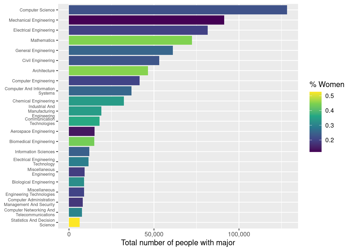
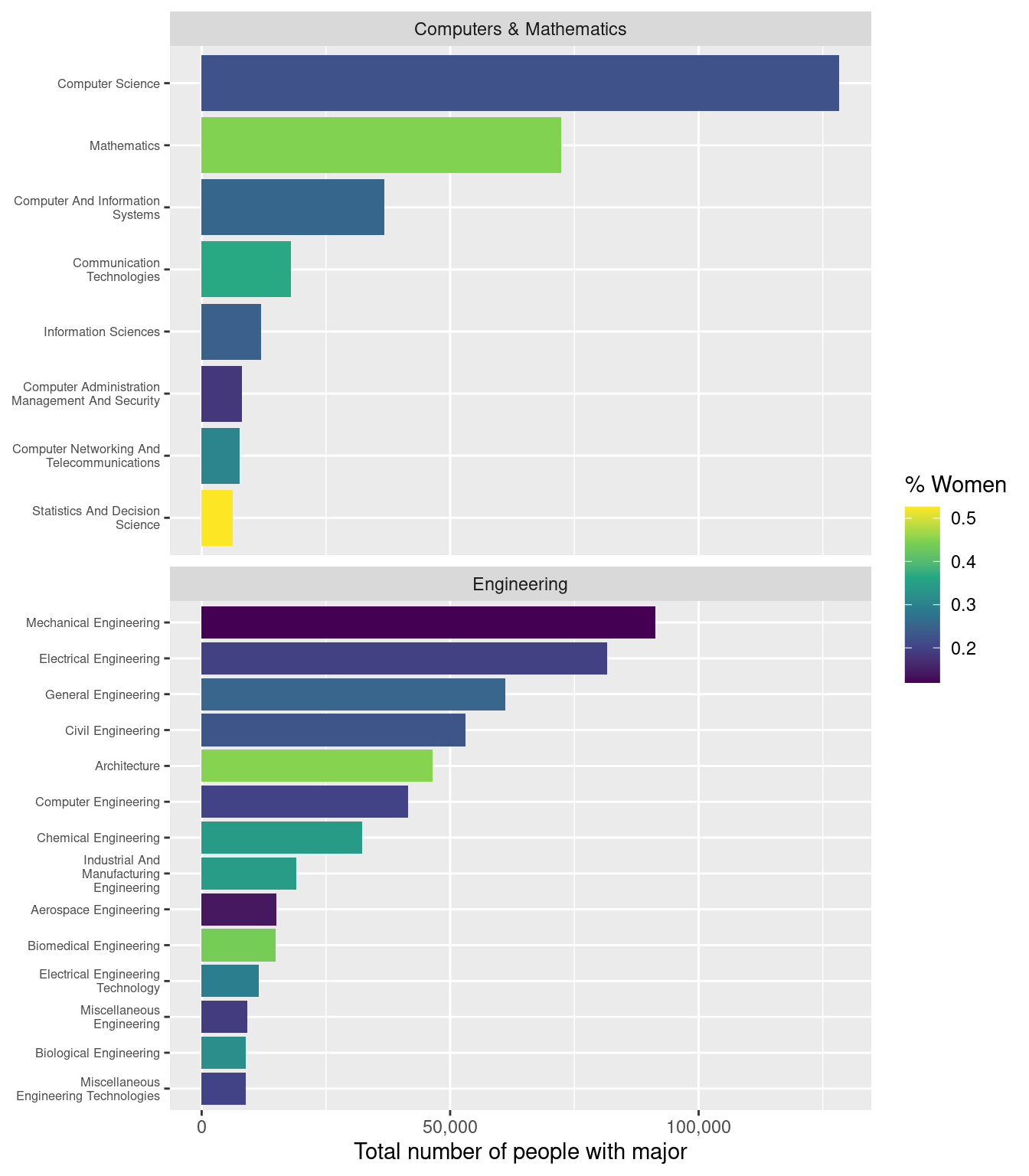
Faceting
Finally, we want to separate the “Computers & Mathematics” majors from the “Engineering” majors. We can do use this by creating sections of identical subplots according the value of a categorial variable. In this case, we facet via the major_category variable.
The facet_wrap() function takes a variable name as its first argument, but for technical reasons, that name needs to be wrapped in the vars() function.
For this plot, we don’t need all majors to be present on the vertical axis each facet, so we’ll set the scales argument (different from the scales package we used above!) to "free_y" (so that the y scales can be free!). We also want to make vertical comparisons across bars, so we’ll force the facets to only occupy one column by setting the ncol argument to 1.
Question
Use the facet_wrap() function to create facets for each major_category. Be sure to set the scales and ncol arguments as specified above.
If you’ve completed each exercise as instructed, your final plot should look like this:
Next Steps
Step 1: Compare solutions
If you’ve done this lab correctly, your final graph should match the one in the Lab Goals. You can check your results at each step by comparing your work for each exercise against the Lab 6 solutions.
Step 2: Complete the Moodle Quiz
Complete the Moodle quiz for this lab.
Step 3: Complete Phase 1 of Final Project
If you have not yet formed a group, you should continue seeking out classmates to work with on the final project.
If your initial data set was not suitable for use in this project, you should seek out another data set to use this week, and submit this data set for approval.
See the Final Project page for full instructions regarding Phase 1 of the project.
Step 4: Optional reading
To prepare for next week’s lab on importing data, we encourage reading the following:
- Sections 2.1 and 2.4 in Data Science: A First Introduction
- Sections 8.1-8.2 in R for Data Science