Some say that a picture is worth a thousand words. In statistics and data science, we have our own version of this saying: a data visualization is worth a thousand numbers1.
Data analysis almost always begins with creating data visualizations because they are extremely helpful for answering big questions you’re likely to have, such as:
What kinds of outcomes were observed in my study?
How are the variables I measured related to each other?
What patterns are present in my observations?
Prof. Jeff Huang (Brown University, CS) gives us a good rule of thumb: start every data analysis project by visualizing your data until you’re not surprised any more.
Data visualizations, if created wisely, are also incredibly effective tools for disseminating information to a wide audience. In general, only a small fraction of your audience will be familiar with statistics and data science. But this won’t matter if you’re able to distill your take-home message into an image; after all, seeing is believing!
Lab Goals
The purpose of this lab is to learn how to create basic data visualizations using tools from the ggplot2 package.
Along the way, we will discuss how to enhance your environment using libraries, and introduce a few basic concepts about data.
Before you open the template, use your computer’s file explorer to move the template file you just downloaded out of your Downloads folder and into your SDS 100 folder.
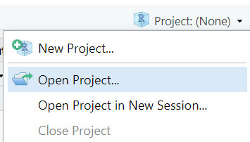
Then, open RStudio, and make sure you’re working in the SDS 100 project. If the Project pane in the top right of your RStudio window doesn’t show “SDS 100”, go to Open Project as shown below and navigate to your project.
Finally, open the template file in RStudio. The easiest way to do this is to go to the Files pane in RStudio, find the lab_03_graphics.qmd file from the list, and click on it.
If you don’t see a file named lab_03_graphics.qmd in the list, make sure you did steps 2 and 3 correctly. If you’ve double-checked your steps, and still don’t see it, ask your instructor for help.
Loading Packages
In Lab 1, you learned how to install R packages from CRAN. Once a package is installed, you can use it after loading it with the library() function. For example, running the command library(tidyverse) (shown below) will load the package making all of the functionality of the tidyverse package (which includes both functions and data objects) available to you for the remainder of your R session.
Code
library(tidyverse)
── Attaching core tidyverse packages ──────────────────────── tidyverse 2.0.0 ──
✔ dplyr     1.1.4     ✔ readr     2.1.5
✔ forcats   1.0.0     ✔ stringr   1.5.1
✔ ggplot2   3.5.1     ✔ tibble    3.2.1
✔ lubridate 1.9.4     ✔ tidyr     1.3.1
✔ purrr     1.0.2
── Conflicts ────────────────────────────────────────── tidyverse_conflicts() ──
✖ dplyr::filter() masks stats::filter()
✖ dplyr::lag()    masks stats::lag()
ℹ Use the conflicted package (<http://conflicted.r-lib.org/>) to force all conflicts to become errors
The tidyverse library prints out a lot of information when it is loaded, but most R pacakges don’t print anything when they are loaded. So, don’t be concerned if it seems like nothing happens when you use the library() function; sometimes, no news is good news!
Question
Insert a new code chunk into your Quarto document. In this code chunk, use the library() function to load the tidyverse package. On the next line in this code chunk, use the the search() function to print out a list of packages that have been loaded, and confirm that you see package:tidyverse in the output.
Note that the list of packages is much longer than just package:tidyverse, because the tidyverse is an “umbrella” package that encompasses many other packages (like ggplot2, dplyr, tidyr, etc.) and because automatically loads a number of “core” packages automatically when it starts up.
It’s worth reflecting for a moment on the distinction between installing and loading a package. By way of analogy, consider the difference between buying a book and reading it.
Installing a package is like buying a book and putting it on your bookshelf. Once you have it, you don’t need to buy another copy. So you only have to install a package once. You may eventually need to upgrade the book if a 2nd edition comes out, but once it’s on your bookshelf, it’s always available to you if you want it. However, the book is still on your bookshelf and not in your brain. Therefore, you can’t actually use it.
Loading a package (via the library() function) is like taking the book off the shelf, placing it on your desk and opening it up. Now all of the information in that book is available to you. Once it’s on your desk, it’s available to you for as long as the book is on your desk. However, when you close your R session, all the books go back on the shelf! So you have to library() a package each time you open a new R session.
At the same time, you don’t want to library() more packages than you need, since then your desk will become cluttered.
Installing Additional Packages
In Lab 1, you learned how to install packages. Today, you need to follow those instructions again, and install one additional package: the palmerpenguins package.
Follow the instructions from Lab 1, and install the palmerpenguins package. If you are using the RStudio server, you can skip this step.
Then, insert a new code chunk into your Quarto document. In this code chunk, use the library() function to load the palmerpenguins package. On the next line in this code chunk, use the the search() function to print out a list of packages that have been loaded, and confirm that you see package:palmerpenguins in the output.
With these packages installed and loaded, we have created our computational workspace.
The gg stands for the “Grammar of Graphics, which is a systematic framework for composing data graphics from various simple elements (Wilkinson 2012). The ggplot2 package implements the grammar of graphics in R, and is one of the core packages in the tidyverse. While we don’t have time in SDS 100 to cover the grammar of graphics, we will develop the basic components of a ggplot2 graphic in this lab, and follow up with more bells and whistles in Lab 6.
Important
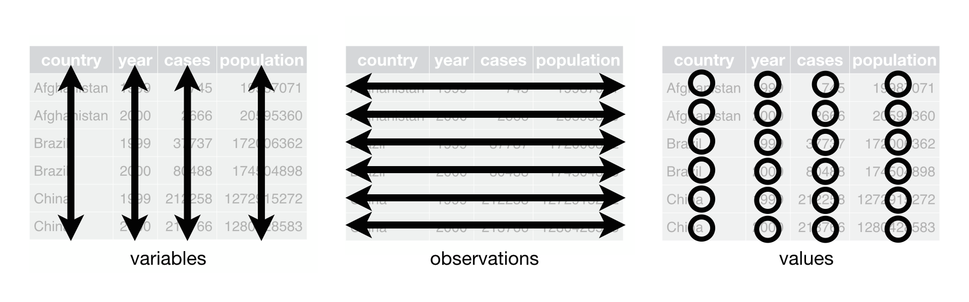
ggplot2 expects your data to be organized in a “tidy” layout (Wickham 2014).
The following three rules make a dataset tidy: variables are columns, observations are rows, and values are cells. This figure is reproduced from R for Data Science, Chapter 5.
If your data are not organized in a “tidy” layout, creating the plot you desire is likely to be difficult. If you’re struggling to create the plot you want to see, ask yourself: Are my data in a “tidy” layout? Sometimes, the secret to making effective use of ggplot2 is to first re-organize the layout of your data!
Components of a data graphic
Every data graphic that you make with ggplot2 will contain at least the following elements:
a call to the ggplot() function that contains:
a data argument that specifies the name of the object containing the data to be plotted
a mapping argument that specifies one (or more) connections between variables in the data frame and elements on the plot
a + operator that adds a new layer to a plot
a call to a geom_*() function that specifies what you actually want to draw.
Below, we develop these elements in more detail.
Univariate summaries
Do the lengths of flippers vary across different species of penguins? This question might be interesting to marine biologists trying to understand penguin evolution.
Let’s first try to understand the distribution penguin flipper length. This kind of univariate (one variable) analysis is fundamental to statistical inquiry and exploratory data analysis.
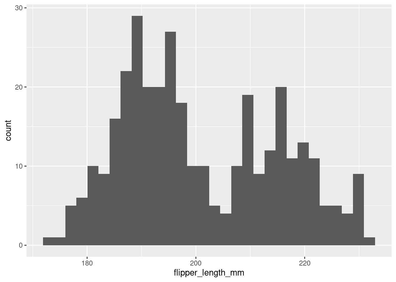
The following simple example creates a histogram of penguin flipper length:
Warning: Removed 2 rows containing non-finite outside the scale range
(`stat_bin()`).
Figure 1
At the most fundamental level, our code consists of: one call to the ggplot() function, a +, and then one call to the geom_histogram() function. In words, you are telling R: “make a ggplot, and then add a layer with a histogram on it.” Everything else that you see in the code are arguments to those functions.
Let’s now unpack those arguments. The data argument to the ggplot() function tells R where to find the data that you want to plot. In this case, the penguins data frame2 contains the data about flipper length that we want to plot. It is very unusual to omit the data argument, since otherwise there won’t be anything to plot.
The second argument to ggplot() is called mapping. It takes a call to the aes() function, which specifies aesthetic mappings from variables (in the data frame specified by the data argument) to attributes of the data graphic. This is at the heart of the grammar of graphics. In this case, the x coordinate (aesthetic) is mapped to the flipper_length_mm variable. This means that when R draws the histogram, it will use the values in the flipper_length_mm variable from within the penguins data frame to determine where on the x-axis to place the data points. Since a histogram is univariate, only the x aesthetic is required.
Question
Modify the code snippet above to create a histogram for the bill_length_mm variable.
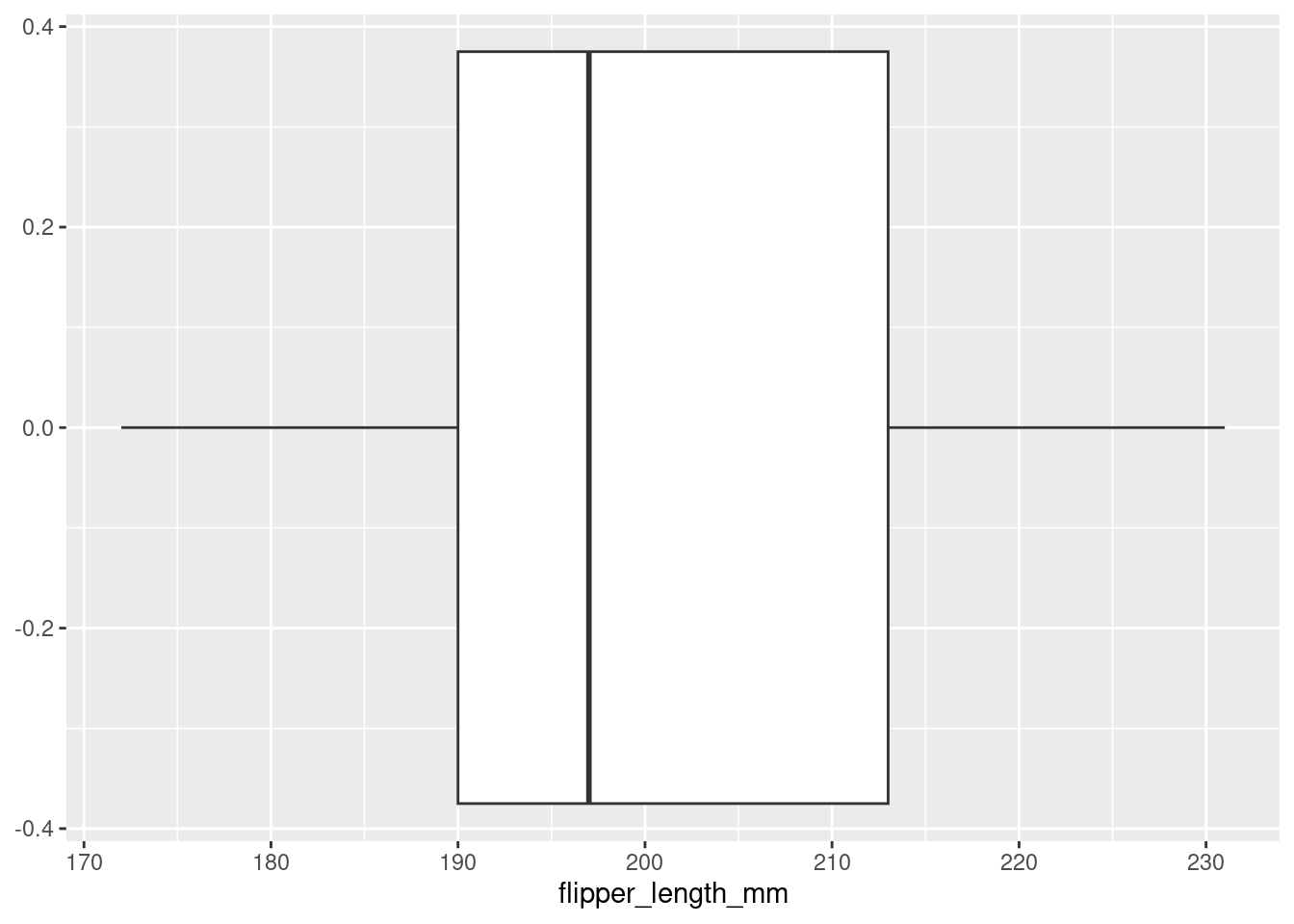
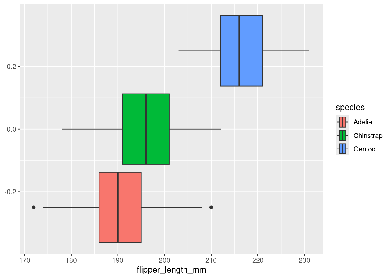
Box plots like Figure 2 provide another way to visualize the distribution of the flipper lengths.
Figure 2
To draw a box plot instead of a histogram, only a small part of our code from Figure 1 needs to change. We will leave our ggplot() “foundation” as it is, and simply instantiate our data with a different geometric object!
Question
Reproduce the box plot of flipper lengths shown above by coping the code for Figure 1, and changing the geom_histogram() function to the geom_boxplot() function.
Tip
If you see the prompt > at the bottom of your console with nothing next to it, R is waiting for you to start a new command and will complete whatever computations that you tell it to. If you do not see your prompt > in the last line of the console, R is waiting for you to complete a command, and you will not be able to do further computations until you see that prompt again.
Tip
Hitting the ESC key will cancel the current command and bring you back to the prompt >.
Bivariate Summaries
Things get more interesting as we incorporate more than one variable. Bivariate data graphics allow us to visualize the relationship between two variables.
If the second variable is categorical
Our original question was about how flipper length varies by species among penguins. So far, we’ve only considered the distribution of flipper length overall. This helps us understand the distribution of flipper length, but we need to incorporate the species variable into our plot if we want to understand how flipper length varies by species.
The simplest way to do this is to map the species variable to the color or fill aesthetic. Let’s continue the example using boxplots. In the code below, we add fill = species to the call to aes().
Code
ggplot(data = penguins,mapping =aes(x = flipper_length_mm,fill = species )) +geom_boxplot()
Warning: Removed 2 rows containing non-finite outside the scale range
(`stat_boxplot()`).
ggplot2 now draws three boxplots: one for each distinct value of the species variable.
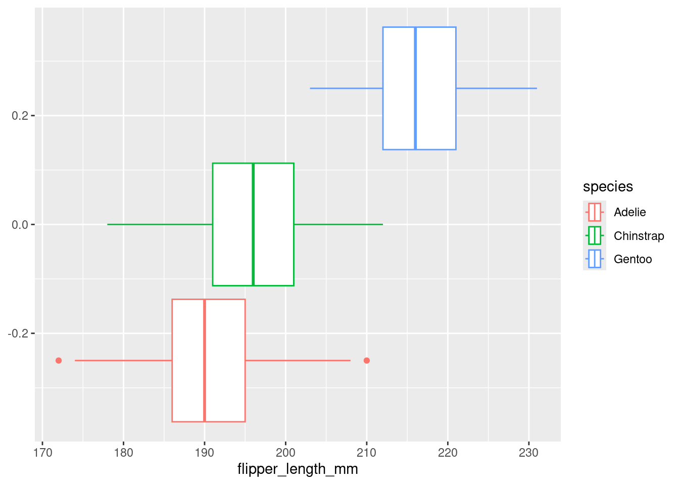
Note that if we use the color aesthetic instead of the fill aesthetic, the border of the boxplots gets the color, but not the interior. In general, different geom_*()’s use different aesthetics. Use the built-in documentation (e.g., help(geom_boxplot)) to learn more about which aesthetics each geom_*() function understands.
Code
ggplot(data = penguins,mapping =aes(x = flipper_length_mm,color = species )) +geom_boxplot()
Warning: Removed 2 rows containing non-finite outside the scale range
(`stat_boxplot()`).
Figure 3
We note that from the boxplot above, it is clear that the Gentoo species has the longest average flipper length.
Question
Create a figure similar to Figure 3 that includes box plots showing the distribution of the bill_length_mm variable for penguins from each island. Make sure that each island is filled in with a different color, and make sure the bill lengths are measured along the vertical axis.
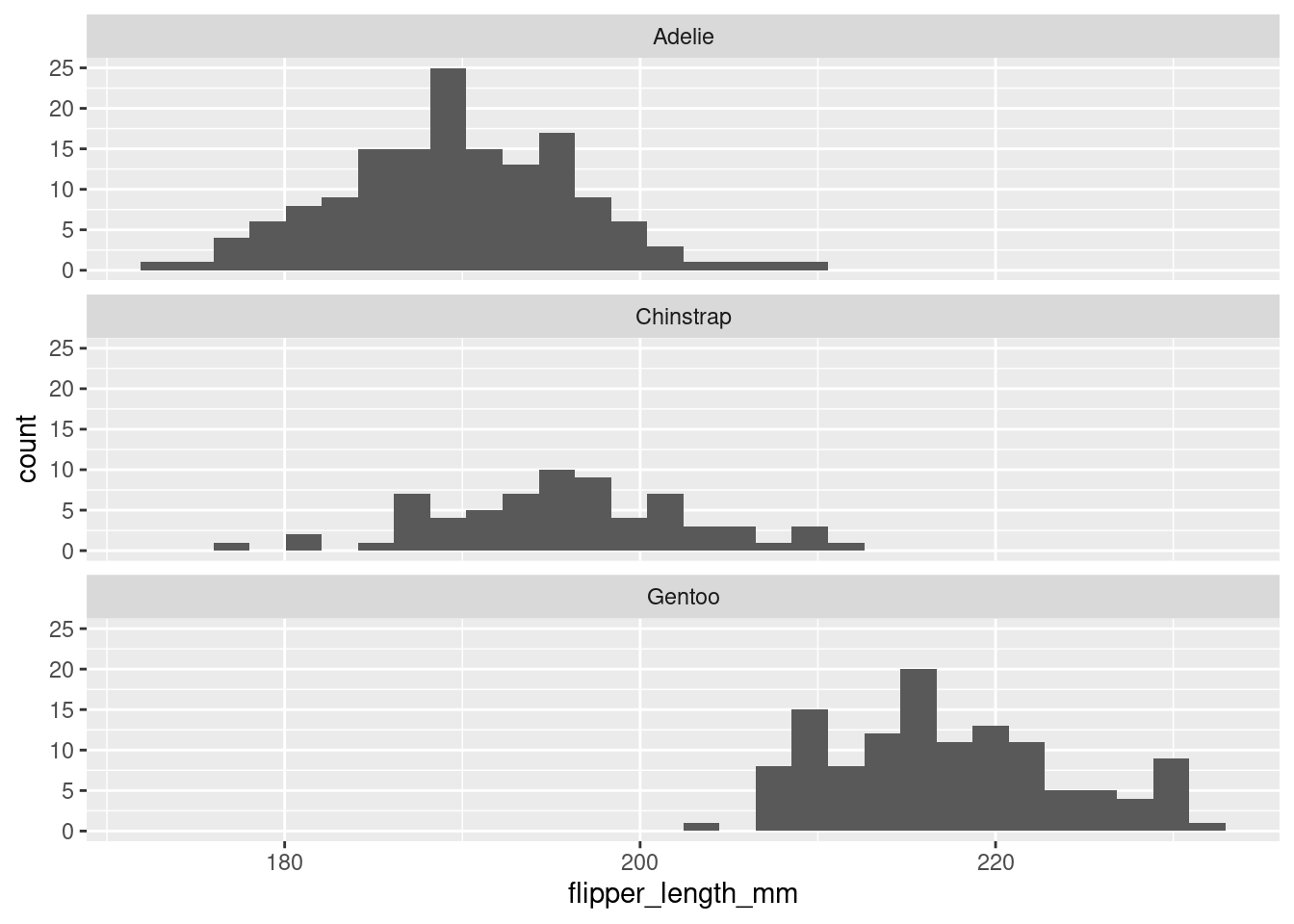
An alternative way to incorporate a second categorical variable is with a facet. Facets are small multiples of data graphics in which the value of one categorical variable varies. Conceptually, facets are often used for the same purpose as colors or fills: to separate the plots by a categorical variable. However, there is no facet aesthetic in ggplot2. Instead, we use the facet_wrap() function, which can be added similar to how we add additional geom_*()’s.
The facet_wrap() function takes a variable name as its first argument, but for technical reasons, that name needs to be wrapped in the vars() function. In Lab 6, you’ll get more practice with facets.
In the code below, we set the ncol argument to facet_wrap() to 1, so that the plots are stacked on top of each other vertically. This allows us to make easy visual comparisons across the x-axis. Figure 4 once again confirms that Gentoo penguins typically have larger longer flippers than the other two species.
Warning: Removed 2 rows containing non-finite outside the scale range
(`stat_bin()`).
Figure 4
Question
Use faceting to create visualization that shows a histogram of the bill_length_mm distribution from each island. In this plot, arrange the three histograms horizontally (i.e., side-by-side); in other words, the plot should appear to have 3 columns.
Then answer the following questions:
Which island seems to have penguins with the smallest bills?
Which type of visualization do you prefer for comparing distributions? Faceted histograms (like the one you just created) or stacked box plot (like in Figure 3)?
If the second variable is numerical
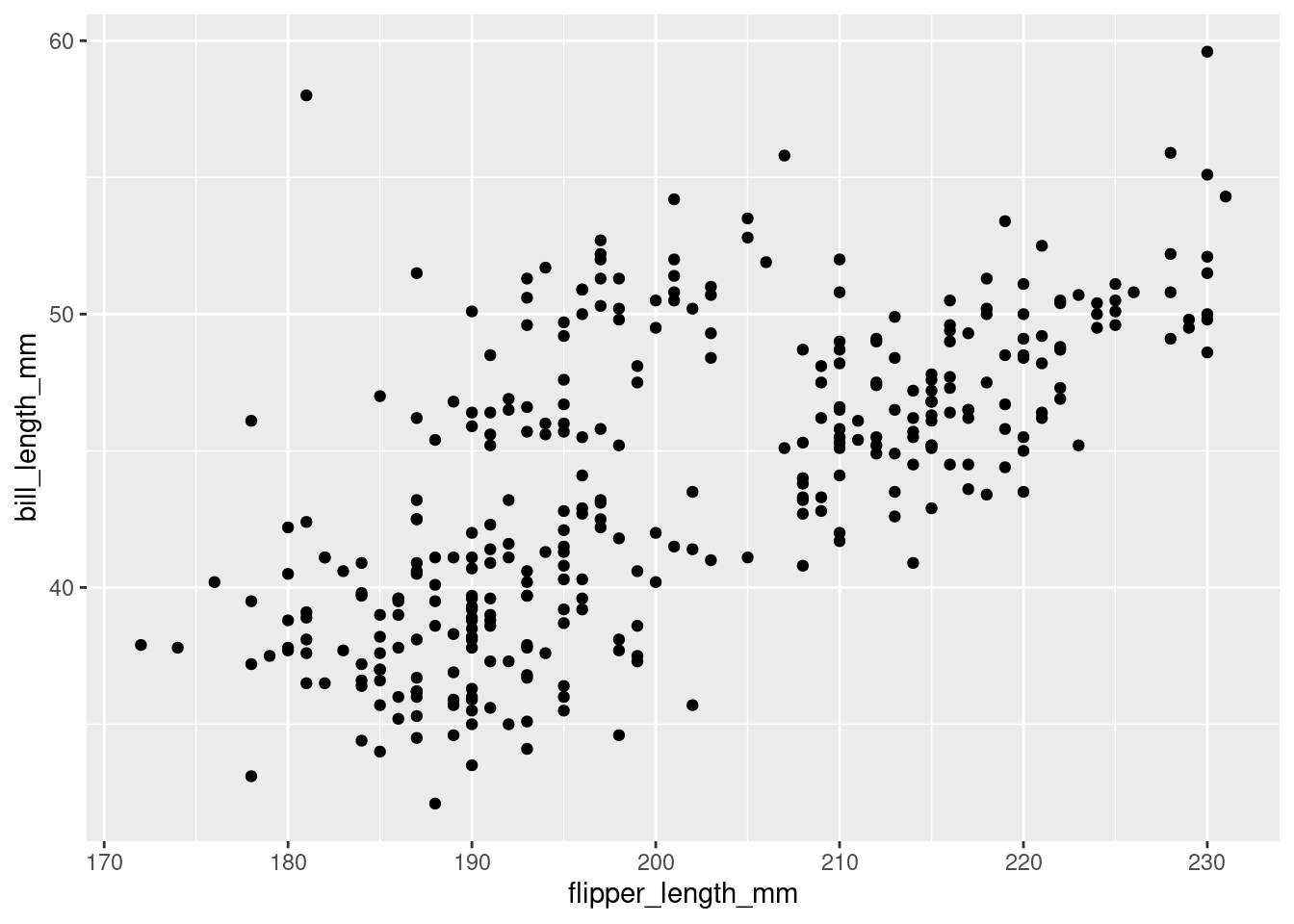
Now consider the relationship between flipper length and bill length. You might hypothesize that some penguins are just larger, so that penguins with longer flippers are also more likely to have longer bills. Or, perhaps the opposite is true: perhaps penguins with longer flippers have shorter bills. Or, perhaps there is no relationship between the two variables at all, and any variation we see is just random.
The quickest way to explore the data, and get a sense of which theory our data might support, is to visualize both variables together in a scatter plot We can create scatter plots by mapping the x and y aesthetics to the two numeric variables we’re interested in, and drawing each observation onto the plot with the geom_point() function.
Warning: Removed 2 rows containing missing values or values outside the scale range
(`geom_point()`).
Figure 5
This scatterplot shows a clear positive trend: penguins with longer flippers indeed tend to have longer bills.
Multivariate analysis
The ggplot2 system allows you to create complex data graphics through two main mechanisms:
layering additional marks on the plot by adding more geom_*()’s (and facets (see below))
incorporating additional variables by adding more aesthetic mappings
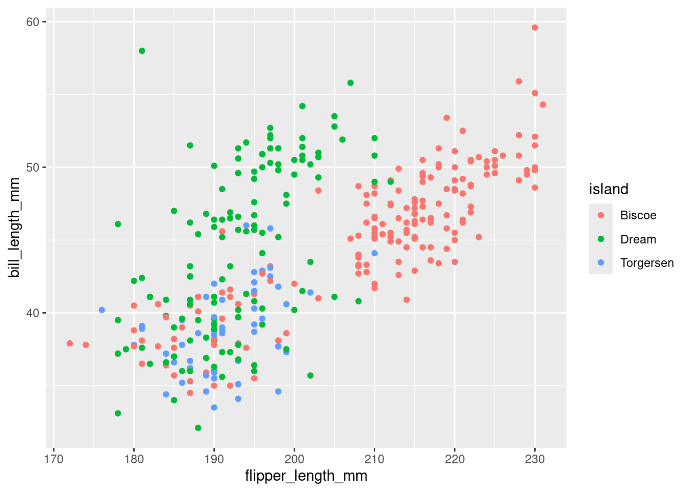
In Figure 6 below, we add complexity to our scatterplot by coloring the points based on the island on which each penguins lives. Note that this data graphic is trivariate, since three different variables are mapped to three different aesthetics.
Warning: Removed 2 rows containing missing values or values outside the scale range
(`geom_point()`).
Figure 6
However, color isn’t the only way we could incorporate the island variable into this plot. Choosing which aesthetic to map your variable to is an important decision, and choosing wisely can be the difference between a plot that brings clarity and a plot that causes confusion.
Question
Explore how using different geom’s to represent the same variable can affect the quality of a data visualization by creating two new versions of Figure 6. Your first new version should use the shape aesthetic to represent the island variable, and your second new version should use the size aesthetic to represent the island variable. After creating these two new versions, explain which of the three (the original Figure 6 and the two new version) you prefer the most and which of the three you least prefer.
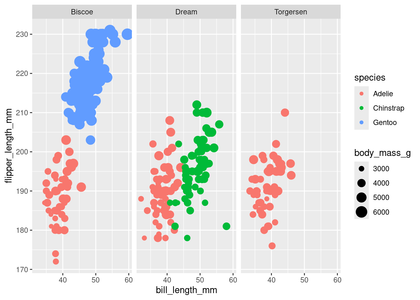
Finally, let’s bring the different things we’ve explored together into one plot:
Question
Use ggplot2 to create a plot that looks like Figure 7.
Figure 7: Flipper and bill length for various penguins.
Self-Contained HTML Documents
Whenever you render a Quarto document, executes all of the code in your Quarto document, and places the output from each code chunk directly beneath the code. This way, your rendered HTML document contains all your writing, code, and results - everything a person could want!
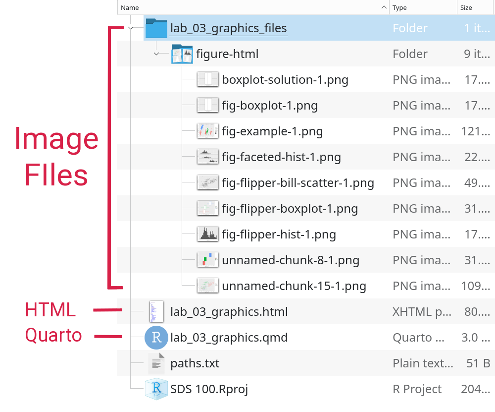
When your R code produces a figure, that figure is stored in an image file separately from your rendered HTML document. Figure 8 shows an example of how the lab_03_graphics.qmd file is rendered into the lab_03_graphics.html document, but all the figures are stored as .png image files in a separate folder.
Figure 8
When you open the HTML document, your web browser follows a link to each image file, and displays them.
However, most of the HTML documents you create are going to be opened by someone else. For example, you might submit your HTML document on Moodle, or email it to your research advisor. When you upload or email the HTML document, the image files stay behind on your computer. That means when your instructor or your research advisor open the HTML document you’ve sent, they won’t see any of the figures you’ve created.
Luckily, there is an easy fix for this problem: embed your figures inside the HTML document permanently by using the embed-resources option for your Quarto document! If you scroll up the top of your Quarto template, you should see a section inside the header that looks like this
title:'Lab 3: Basic Data Visualizations'format:html:embed-resources:true
The format ➔ html ➔ embed-resources: true portion of the header ensures that any figures that get created won’t go into separate files, and will instead be embedded directly into your rendered HTML document.
Important
Whenever you’re making an HTML document to send to someone else, don’t forget to make it self contained! You can do this by changing the default settings in the document header:
Change this…
format: html
… to this!
format:html:embed-resources:true
And, take special care to exactly match the formatting and spacing!
Next Steps
In this lab, we learned how to use ggplot2 to build data visualizations. But we still have much to learn. So far, our plots do not have titles, appropriate scales, or readable axis labels. In Lab 5, we will explore how to add these critical pieces of information.
Other tools can help facilitate rapid prototyping of ggplot2 data graphics using graphical user interfaces:
esquisse: creates an RStudio add-in that provides a graphical user interface to creating ggplot2 graphics, and exports valid ggplot2 code.
mosaic: provides a similar, but simpler graphical user interface for multiple graphics systems.
You are welcome to use these tools to accelerate your learning, but ultimately, we expect you to be able to read and write ggplot2 code without their assistance.
Step 1: Compare solutions
Double check that you’ve completed each exercise in this lab, and have written a solution in your Quarto document. If so, render your Quarto document into an HTML file. Then, check your work for each exercise by comparing your solutions against out example solutions.
Step 2: Complete the Moodle Quiz
Complete the Moodle quiz for this lab.
Step 3: Optional reading
To prepare for next week’s lab on data wrangling, we encourage reading sections 3.1-3.4 in R for Data Science
I made this up, but honestly it sounds pretty good. - Will↩︎
Be aware that another rectangular data structure in R that used extensively in the tidyverse is called a tibble. All tibbles are data.frames, but not all data.frames are tibbles. For the most part, the distinction not important for the work you do in this class, but it’s a good vocabulary word to know.↩︎